Universities use various techniques to promote themselves as inspiring places of study. Traditionally, open days and prospectuses have helped in this area, but today, thanks to the internet, would-be students can find out a whole host of extra information – updated on a regular basis. By visiting college websites on their laptop, tablet or mobile device, budding learners can look into courses offered and get a glimpse of what student life is like in different places around the country.
Moreover, beyond simply attracting new students, a university’s website is part of its very identity – and an online extension of its physical location. In view of all this, it’s such a pleasure to see how some schools have really gone the extra mile to offer an exciting online experience. The 30 institutions on this list have recognized the value of responsive, well-branded and multi-platform sites that feature great visuals and modern design elements – engaging prospective students and casual visitors alike.
30. Champlain College
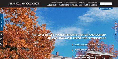
An in-house team from Burlington, Vermont-based Champlain College teamed up with interactive agency BarkleyREI to reinvent the private institution’s website. After almost two years of development, the redesigned site went live in March 2013. What’s more, shortly afterwards, in August 2013, it was nominated as Best Homepage at the eduStyle Web Awards. The distinctive website uses strong visuals and a clean, well-balanced look to give users an insight into life at Champlain College while also communicating some of the school’s personality and educational approach.
29. Delaware Valley College
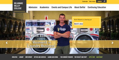
“Rad and responsive.” That’s how digital agency Happy Cog describes the new website of Delaware Valley College. Redesigned in late 2012, the site uses a high-impact gray, white and yellow color scheme and large visuals to make a solid first impression. Delaware Valley College realized that potential students might first check out an institution on a mobile device, and with this in mind it got in touch with Happy Cog for help. According to the digital agency, the college asked it to “deliver a responsive website that would resonate with their audiences and tell the story of the college’s close-knit campus and tactile academic experience.”
28. Rhode Island School of Design
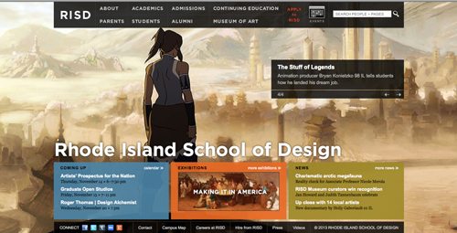
Established in 1877, the Rhode Island School of Design is a fine arts and design college based in Providence, RI. Likely hoping to inspire its next generation of artists and designers, the school uses its online home to showcase artwork from its current students and alumni. The school’s new-look site was redesigned in house in 2011 and was a Webby Award honoree in the School/University category in 2012.
27. Stonehill College
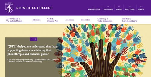
Stonehill College – a Roman Catholic liberal arts school based in Easton, Massachusetts – launched its charmingly redesigned website in May 2013. The launch of the new-look online space was overseen by Stonehill’s marketing department, who worked with Baltimore-based digital agency Fastspot to revamp the site yet retain the more familiar essence of the university. The homepage uses strong visuals and a modern scroll-down approach to present content in a fun, informative and eye-pleasing manner.
26. Maryland Institute College of Art

The Maryland Institute College of Art is one of the world’s most highly rated design colleges, so when it came to the redesign of its website, a confident approach and excellent implementation were needed. With this in mind, in 2009 the college worked with digital agency Happy Cog to give the site a makeover. “An art school that shows art on its website. Imagine that!” wrote former Happy Cog interactive director Dan Mall. For anyone who visits the website, selecting one of the student artworks visible in the slideshow at the top of the homepage switches the site’s color theme, and according to Mall, from a technical point of view this was surprisingly challenging.
25. University of Notre Dame
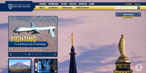
Developed by an in-house team and launched in April 2012, the University of Notre Dame’s responsive new homepage certainly pushes boundaries. The stunning site has an uncluttered look and features attention-grabbing photography, plus fast-scrolling navigation that takes users to the relevant section. Such factors give the Indiana university’s homepage an elegant feel, and the manner in which it automatically adjusts means it looks equally good on tablets and smartphones. “We wanted to make the navigation as intuitive and simple as possible,” explained the team’s web designer Philip Zastrow. “In a lot of ways a homepage is a portal, but we want it to be a more experiential, informative portal.”
24. Saint Joseph’s University
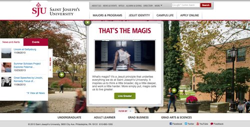
NavigationArts was the digital agency behind the award-winning new web redesign for Saint Joseph’s University. The site uses fun pop-up elements, a neat filtering system, and an unobtrusive news and events menu to update the reader about life at the Philadelphia-based Roman Catholic Jesuit school. The end result is an informative site without text-heavy clutter. In 2012 the site won a Best In Class Interactive Media Award in the University Website category and was an honoree for a prestigious Webby Award.
23. Bob Jones University
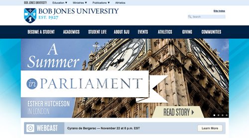
Bob Jones University is a private Protestant school based in Greenville, South Carolina. The university’s strikingly neat and sophisticated website was redesigned in early 2012 by an in-house team and features strong, engaging photography. Contrasting shades of blue, stylish icons and straightforward navigational elements give the site a slick, precise look. In 2013 Bob Jones University’s sub-sites “Why Choose BJU” and “LIFEatBJU” won a combined haul of seven eduStyle Awards.
22. Rocky Mountain College of Art + Design
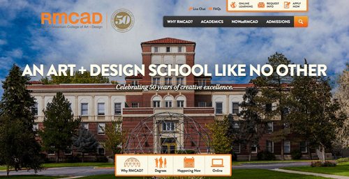
In 2012 the Denver-based Rocky Mountain College of Art + Design launched its beautiful new responsive website. The site features massive, high quality images and innovative navigation techniques to inject personality and flair. Florida-based digital agency Purple, Rock, Scissors was chosen to give the site its makeover, and a lot of thought and consideration went into breaking the standard website mold to focus on visual and engaging content. In recognition of this, 2013 saw the site win Silver at the Orlando ADDY Awards and get listed as a Webby Award honoree.
21. Johns Hopkins University
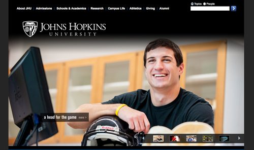
Considering the fact that it hasn’t been redesigned since 2009, the Johns Hopkins University welcome page is surprisingly fresh and modern looking. With its emphasis on photography and its streamlined newsfeed and links, the homepage is engaging, neat and easy to navigate. The rest of the website is admittedly a little less sophisticated by comparison, and in October 2013 the Baltimore university announced its plans to give the site an overhaul in 2014. Still, the homepage demonstrates that good design can stand the test of time.
20. Harvard University
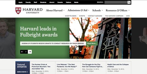
Located in Cambridge, Massachusetts, Harvard is one of the world’s most prestigious universities, so a modern, up-to-date website is pretty much an essential requirement. In 2011 Harvard worked with web consultancy Happy Cog to develop a responsive new site that better suited the school’s esteemed academic standing. As testament to the value of the transformation, the site received a Best In Class Interactive Media Award in 2011, while in 2012 it was a Webby Award honoree in the School/University section.
19. Oberlin College
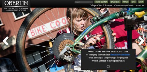
In 2007 Ohio liberal arts school Oberlin College turned to Jersey City-based designer Ed Mullen to breathe new life into its website. An in-house team then revamped the homepage in 2013, creating an engaging new welcome page, which uses strong images and draws on students’ personal experiences. In working on the earlier redesign, Mullen was faced with a list of needs from the school’s different stakeholders, and as he explained, “Finding a balance with solutions that satisfy all parties was the challenge.” Impressively, the site was nominated for two eduStyle Web Awards in 2013.
18. Brown University
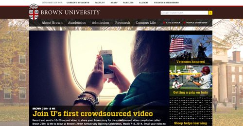
Rhode Island’s Brown is a research university and another institution with no small amount of prestige. It thus makes sense that the school should want a sophisticated and contemporary online presence. Work began on a new website as early as 2008, although it wasn’t launched until 2010. The project was overseen by the university’s Vice President for Public Affairs and University Relations, Marisa Quinn, who worked with the school’s Computer Information Services team to produce a site that better “showcases the university.”
17. Belmont University
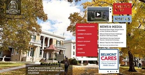
The website of Nashville’s Belmont University has a strong emphasis on visual impact; the homepage almost looks more like a creative scrapbooking page than the online space of an institute of higher learning. Impressively for such an interesting looking site, the redesign work was done entirely in-house. Belmont’s designers joined forces with the Christian school’s IT division to overhaul the website and create the charming new design, which was launched in 2011. Explaining the unconventional homepage, designer April Maglothin said, “The first impression of Belmont should be the controlled, creative chaos that is Belmont.”
16. Neumont University
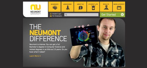
Utah-based applied computer science-focused school Neumont University was founded as recently as 2003. Neumont launched its cutting-edge new site in 2008 with a view to attracting top software developers and other technologically minded innovators to the university. “The website’s goal is to credibly reinforce the fact that Neumont University is a leader in the field of technology,” explained the school’s communication manager Stacy Hughes, who worked on the project. And staying ahead of the curve, the site was given another makeover in 2011.
15. Clemson University
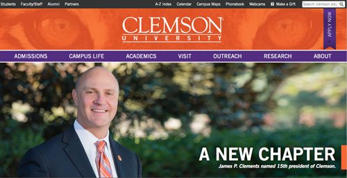
South Carolina-based Clemson University’s mascot is “The Tiger,” and the school’s nickname is the Clemson Tigers, so it’s only fitting that its official website should employ a roaring orange color scheme. The striking tiger’s eyes used in the masthead are a clever, well-executed touch, as they really help to anchor the site and give it personality. Launched in 2013, the mobile-friendly redesign was a joint in-house venture developed by Clemson’s Web Leadership Team and Communications Council.
14. Full Sail University
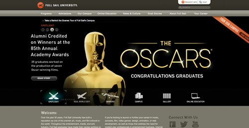
Full Sail University is an entertainment and media institution that offers courses such as video and film production. Now based in Florida’s Winter Park, the school was established in 1979 in Ohio before relocating to its present location in 1989. Content management system experts Alfresco and in-house design team Platinum Creative both contributed to bringing the university’s flashy new site to life, and in 2012 it was a Webby Award honoree in the School/University category.
13. Davidson College

Davidson College’s homepage offers a glimpse into life at the North Carolina liberal arts school through powerful lead images, a neat, well-designed layout, and news and events sections. Further down the homepage things get a bit more social, but the strongest impression is made up top. Launched in August 2013, the revamped website was designed with input from an in-house team that involved the college’s communications, I.T., relations, admissions and financial aid departments, not to mention various representatives from other areas. BarkleyREI (who also worked on #30 Champlain College!) was responsible for architecture, design, and development.
12. Bates College
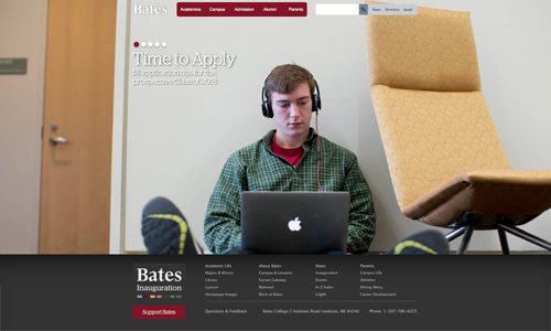
Lewiston, Maine liberal arts school Bates College unveiled its impressive new website design in November 2011, and less than a year later the site scooped Best Overall Website and the People’s Choice Award for Best Homepage at the 2012 eduStyle Awards. Designed in-house, the dynamically arranged site uses large photos of students (and the school’s Bobcat mascot) to offer a human glimpse of student life at Bates with which visitors can connect. The site also puts an emphasis on student and staff blogs, adding to its candid, behind-the-scenes feel.
11. Middlebury College
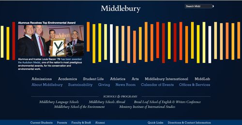
Middlebury College’s stylish website and unique navigation system might be interpreted as an online representation of the creative thinking the Vermont-based liberal arts college aims to inspire. With a homepage developed by White Whale Web Services, the simple, elegant and inventive site was launched in February 2010. By clicking on each of the colorful bars, users are treated to different news stories and videos relating to the university and its students. However, in May 2013 Middlebury student blog Middbeat received a tip-off that the university plans to redesign the site to make it “less confusing.” The blog’s response was one of outrage, and several students replied with shock and indignation, too.
10. Bay State College
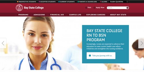
Bay State College in Boston, Massachusetts turned to Baltimore-based digital agency Fastspot to help it “connect with a diverse group of prospective students, while also improving the image of the school and increasing brand awareness.” The new website went live in 2011, and in 2012 it was nominated for a Best Redesign eduStyle Award. To really sink their teeth into the project, Fastspot personnel visited the campus during the development stage and spoke to students to get a taste of what the private college is “all about.”
9. DePauw University
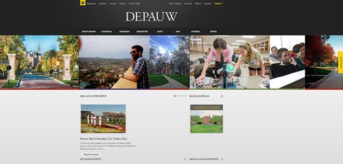
With its charcoal, gray and yellow color scheme and beautiful use of photography, DePauw University’s website almost looks more like something you’d expect from National Geographic than an institute of higher learning. Designed by an in-house team, the new site launched in December 2011, and the Indiana-based school’s director of strategic communications, Jon Coffin, was practically beaming with the finished product. “I think you would be hard-pressed to find another college website out there that looks like this one,” he declared.
8. University of Rochester
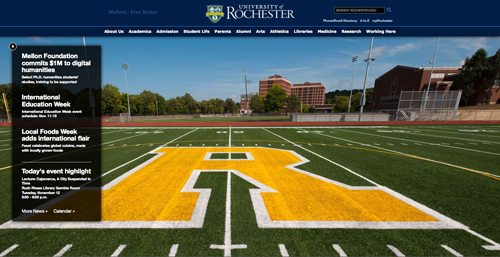
The University of Rochester’s homepage is simple and elegant, with an emphasis on wide-open spaces and high-quality photography. Unlike a lot of other school websites, it isn’t overloaded with information, quotes and catchphrases. Instead, users are greeted by huge, alternating photographs, a simple news bar on the left-hand side, and a neat series of headers that help users navigate around the site. As an extra touch, website visitors can find out the story behind each image by clicking on an “about this photo” button. Designed by the New York state university’s in-house communications web team, the new look-site was launched in 2008 and fine-tuned in 2012.
7. The Cooper Union for the Advancement of Science and Art
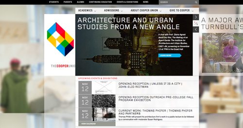
Based in Manhattan, The Cooper Union for the Advancement of Science and Art, also known as Cooper Union, offers fine arts, architecture and engineering undergraduate and master’s degrees. Given this specialty, it’s perhaps no surprise that the Cooper Union website is slick and sophisticated, with an emphasis on eye-pleasing design and functionality. Cooper Union graduate and lead designer Thea Kluge Rossi worked with New York-based web company Behavior on the new-look site, and phase one was launched in November 2009. In 2013 the completed website was listed as a Webby Awards honoree.
6. Boston University
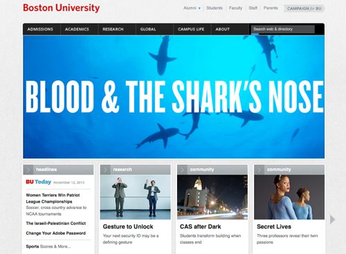
Boston University’s official website underwent a significant makeover in 2010. It was the first redesign of the site since 2006, and the results were quite a step up from the previous iteration. The more engaging new look was overseen by the university’s creative director of new media, Scott Dasse, who explained that his team developed a tailored content management system, improved the search functionality, and geared the site up for more frequently published features and news headlines.
5. School of Visual Arts
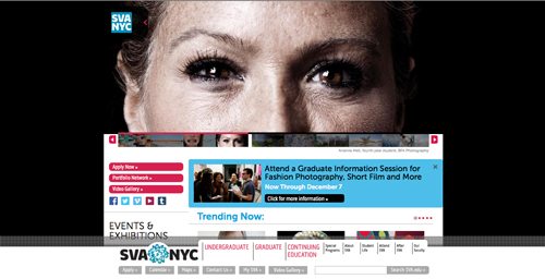
It’s no surprise that prestigious New York City art school the School of Visual Arts has a strikingly beautiful and well laid-out website. Thanks to the homepage’s eye-catching slideshow of images and quite fascinating feature articles, the site seems almost more like an engaging online magazine than a typical school website. Designed by New York-based agency Funny Garbage, the upgraded site was launched in March 2012. Predictably, perhaps, several of the school’s departments also played vital roles in the development process.
4. Brooklyn College
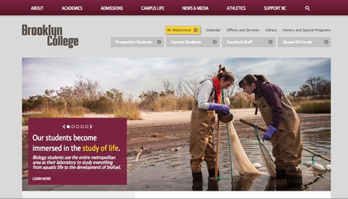
Launched in 2011, Brooklyn College’s impressive new website was developed by Baltimore-based interactive agency Fastspot. To nail the site’s strong, well-branded look and really make it pop, Fastspot worked with fellow Baltimorean agencies Neustadt Creative Marketing and Door No. 2. The college is often referred to as “Harvard on the Hudson,” and the website’s great visuals really show off the institution’s picturesque surroundings. Rebranding, site re-architecturing and redesign were all part of the process, and Fastspot also developed an online virtual tour of the Brooklyn College campus that was listed as an honoree in the School/University section of the 2013 Webby Awards.
3. Drexel University
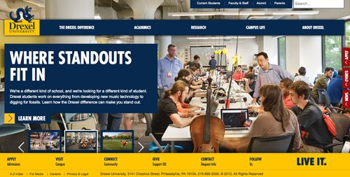
Philadelphia’s Drexel University was established in 1891, but there’s nothing old-fashioned about the institution’s attention grabbing new website design. Launched in October 2012, the new-look site was designed by award-winning digital agency NavigationArts, who worked with the university to show off Drexel’s “unique brand attributes.” While emphasizing a strong visual identity for the school, NavigationArts created a dozen fixed and fluid-response design templates that adapt to different devices, maintaining screen resolution. In 2013 the site achieved a Davey Gold Award for Best Education Site and a WMA WebAward for Outstanding Education Website.
2. The University of Chicago
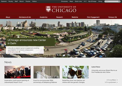
The University of Chicago’s striking, newly revamped website combines high-quality visuals, a clean layout, and bite-sized pieces of easily digestible information. The elegant looking design, which was made public in September 2012, was a collaborative project involving the university’s information technology and communication departments, who were aided by various other UChicago partners. In May 2013 the site was honored with two high-profile Webby Awards, winning in the overall School/University Webby Award category as well as picking up the Webby People’s Voice Award.
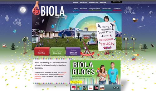
1. Biola Undergrad
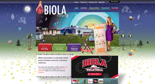
The redesign of private Californian evangelical school Biola University’s undergrad website was launched in November 2010 and is crammed full of personality and charm. The site was designed by art director Jess Kemp, who explained that the “main objective was to make sure the students could find what they were looking for easily, and have fun doing it.” It seemed to work, and as one commenter said, “Everything about this is site is phenomenal. Wow.” In 2011 the site won a number of awards and was listed as an honoree by the Webby Awards, which The New York Times has described as the “Oscars of the Internet.”