Within the past few decades, our lives have become infinitely more digital. According to 2012 data, almost 80 percent of North America’s population uses the internet. Online content is powerful, and users can connect to their favorite sites and brands with the click of a mouse. It’s therefore not surprising that web design has become one of the most popular areas of collegiate study today. Still, as the Internet continues to evolve, web designers have a tougher job than ever. The industry demands that designers create websites that look good without compromising on functionality, and they must also consider metrics such as traffic growth and the amount of time users spend on site. Such considerations are similarly relevant when it comes to the sites of major celebrities, which have the potential to draw high volumes of traffic. Design, functionality and creativity come together in the following ten amazing celebrity website designs.
10. Michel Gondry
Michel Gondry’s name has been splashed across movie screens for years, and the filmmaker has also directed commercials, including ads for Smirnoff vodka and clothing retailer Gap. In addition, he has created music videos for iconic artists such as The White Stripes, Daft Punk, The Rolling Stones, and Sheryl Crow, among others. Perhaps Gondry’s biggest claim to fame, however, is being honored with an Oscar for Best Original Screenplay for his 2004 film Eternal Sunshine of the Spotless Mind, an award he shared with collaborators Pierre Bismuth and Charlie Kaufman. It’s only natural that Gondry’s website encapsulates his whimsical creative style. The site depicts a cartoon figure of Gondry parading a clickable belly button, with the French auteur’s film trailers, news, gallery and fan submissions (“Gondrybutions”) displayed neatly inside boxes that expand before the visitor’s eyes.
9. Leonardo DiCaprio
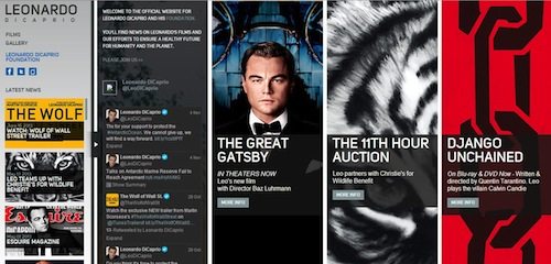
It would have been hard not to notice Leonardo DiCaprio in the past two decades. The prolific actor has starred in multiple blockbusters playing a variety of characters, among them broke artist Jack Dawson in Titanic, clever conman Frank Abagnale in Catch Me If You Can and the legendary Jay Gatsby in 2013’s The Great Gatsby. Such information is provided on DiCaprio’s website, which features multiple columns across the page – a slick design befitting the Hollywood star’s image. The site includes the latest news on the actor, his Twitter feed, information on his new movies and 11th Hour Charity Auction, and more. And the aforementioned columns also display more information when clicked on by the user.
8. Jay Z
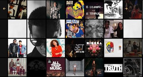
The many accomplishments of hip-hop superstar Jay Z can hardly be contained within a box – but his website seems to achieve just that. Described as “a digital experience covering art, sports, music, fashion and culture,” Jay Z’s Life + Times looks more like an online lifestyle magazine than a celebrity site. The homepage features dozens of boxes that, upon rollover, display more information. What’s more, the site contains a multitude of content, including feature articles, news stories, videos and interviews. Area 17 of New York and Paris designed the website, using WordPress to build it. Apparently, the grid layout was tricky to work with, but the designers used innovative techniques to make sure it performed well besides looking good. WordPress founder Matt Mullenweg is a fan of the site, having described it as among his personal favorite WordPress implementations.
7. Katy Perry
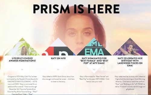
Pop princess Katy Perry is known as much for her catchy tunes and lyrics as she is for her outlandish outfits on and off stage. Her website is just as fanciful as her costumes and music, with different background images of the star alternating as the user scrolls down the page. It’s all very bright and easy on the eye. The homepage also displays links to Perry’s latest news and appearances. Then, scrolling down, visitors can see links for her new album, a featured video plus a link to additional vids, and her upcoming events and concert dates. Tweets are shown in a cool speech bubble-like fashion, and users can click on them to retweet or reply. The site was produced in 2013 by ICON Interactive, a web design company with offices in New York and Boston whose portfolio includes work for other big-name stars such as Alicia Keys and the Beastie Boys as well as companies like BMW and Land Rover.
6. Jeff Bridges
Jeff Bridges has dipped his toes into various waters, acting in movies such as Iron Man and fan favorite The Big Lebowski while also putting his vocal skills to good use in the country music scene. This talent combination and Bridges’ accessible-seeming persona are reflected in his website. An animated pencil sketch complements the simple homepage design, accompanied by a handwritten font that spells out the name of the site and the word “Welcome.” By clicking, the user is taken to a table of contents that displays links to Bridges’ latest endeavors, as well as his music, photography, filmography, and even a message board. The effect is such that it almost looks as though Bridges doodled his entire website, and it’s a wonderfully minimal yet inspired piece of design. The Dude would be proud.
5. Björk
Icelandic-born musician and producer Björk rose to fame in the 1990s, and she has stood the test of time to stay relevant today. Björk has garnered international acclaim and had already shifted over 15 million records globally by 2003. She has also won several MTV Video Music Awards, been nominated for over a dozen Grammys, and received column inches for her crazy fashion choices. Fittingly, the artist’s website is as unconventional as her choice of attire, displaying an animated intro of swirling symbols. There’s a menu on the left where visitors can select “present,” which brings up links to the singer’s social media pages, or “past,” which includes expanding lists of her discography and videos, among other things. The sparse yet engaging site was designed by M/M Paris and developed by award-winning Toronto agency Jam3. “In creating the 3D site using Javascript on an HTML5 canvas, we really believe we have broken new ground and set a standard for sites that want to rely heavily on animation in 3D,” said Jam3 technical director Mark McQuillan.
4. Tim Burton
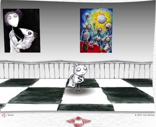
Having helmed such classic films as Edward Scissorhands and The Nightmare Before Christmas Tim Burton is arguably Hollywood’s king of all that’s mysterious and strange – and we would expect no less of the celebrated director’s website. The online space is set up almost like a basic video game, inviting the user to navigate through it using the character “Stain Boy,” who is moved around using either the keyboard’s arrow keys or the controls visible at the bottom of the screen. This cute bug-eyed black and white-caped icon leads the visitor into a hallway with doors marked “Public Gallery” and “Private Gallery.” The Private Gallery requires users to sign up with an email address in order to gain access to all things Burton. Meanwhile, in the Public Gallery Stain Boy can walk through a room decorated with Burton’s colorful paintings. The website plays eccentrically eerie music as well as movement sounds for Stain Boy, offering an experience only Burton could deliver. All in all, it’s sweetly interactive.
3. Rihanna
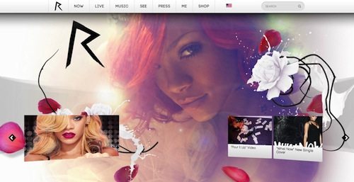
Rihanna is known for many things: her music, her stage attire, her alluring dance moves, her tumultuous relationship with singer Chris Brown, an impressive list of awards, and her sometimes scandalous tweets and presence on social media. As for her website, well it’s definitely something that should gain recognition for the musical diva. The menu bar at the top of the homepage is supplemented by a slideshow underneath featuring changing photos of RiRi in the background and different pieces of news for visitors to click on. And while the navigation arrows may take a second to load, this allows the user to focus on the current content rather than immediately clicking ahead. The highly visual site contains Rihanna’s biography as well as her most recent news, tour dates, discography, and more.
2. M. Night Shyamalan
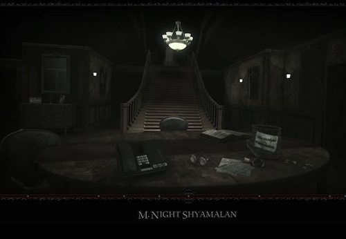
You may not want to visit M. Night Shyamalan’s website while it’s dark out, as the intro is as spooky as some of the director’s most unsettling films. Offering a first-person perspective, it takes the visitor through a door into a decidedly creepy house, complete with chilling sound effects. You can, however, skip past this to discover that (as with Tim Burton’s website) the user must navigate through this digital world using arrow keys. Shyamalan’s interactive site requires active participation from visitors in order for them to gain access to different rooms. For example, the user must place a piece of broken glass inside a mirror to get inside Unbreakable, while to enter The Sixth Sense they have to turn a thermostat all the way down and then click on it to gain access to the room. The website was designed by international agency Lightmaker and won Best Celebrity/Fan site at the 2009 Interactive Media Awards. As Shyamalan himself said, “Lightmaker completely exceeded my expectations.”
1. Jim Carrey
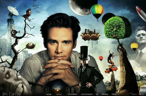
There’s nothing particularly hilarious about funny guy Jim Carrey’s website, although it could well be labeled a more than a little kooky. With its quirky aesthetic, the site is creatively engaging and interactive yet at the same time functional – attributes that might be said to epitomize great web design. Although the website takes a while to load, the surreal concept more than makes up for the time lag. Carrey’s biography displays within the pupil of a massive moving eye, while his recent news appears inside a floating zeppelin. Elsewhere, clicking on the actor’s filmography brings the user to a magical place where many of his most notable on-screen characters reside. The site even features a bird with Carrey’s head chirping out his latest tweets.
This spectacular online space was designed by Santa Monica-based 65 Media, and the agency won a number of prizes for the site, including a prestigious Webby Award. It truly gives us the most creative, interesting and altogether inspiring approach to website design we’ve found among celebrity websites.


